A Dozen Examples of Highly Interactive Excel Reflows
Static dashboards waste time. Dynamic dashboards eliminate the waste—and make interactivity possible when you need it.

SUMMARY: Every Excel dashboard must be ready for interaction when it’s needed. The Excel Data Plumbing Strategy makes that possible, starting with one command and scaling to any future view.
The gallery below shows more than a dozen real examples of dynamic dashboards built using various generations of flowbooks. It’s what the future of Excel looks like when you stop building static Frankenbooks and start thinking like an Excel Data Plumber.
To view the different dashboards, click the arrows at each side of the thumbnails at the bottom of this figure:

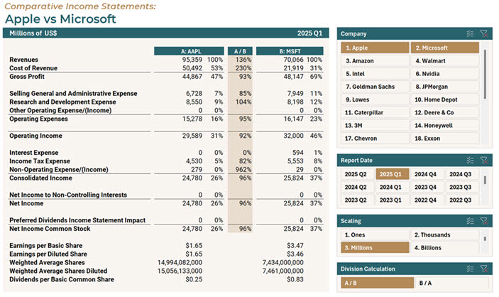
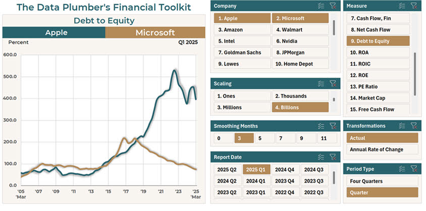
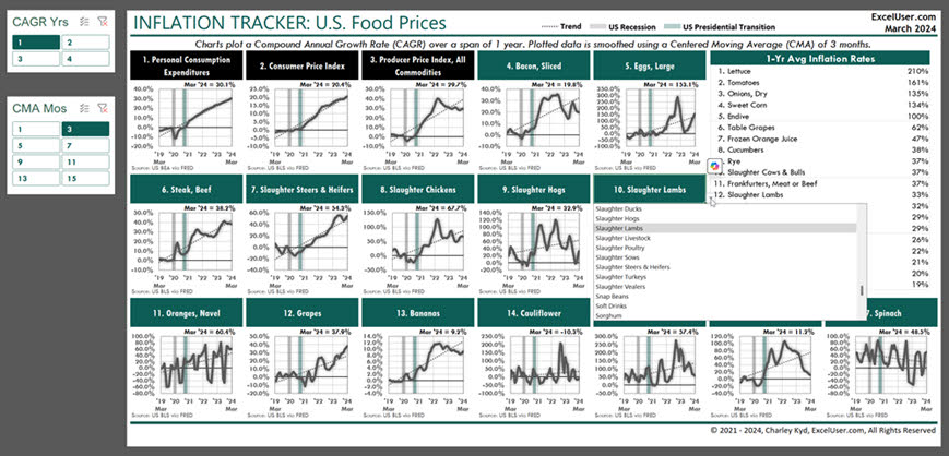
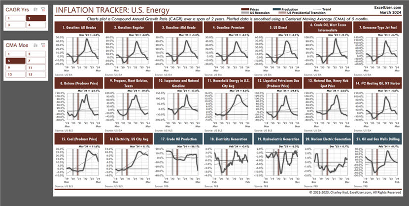
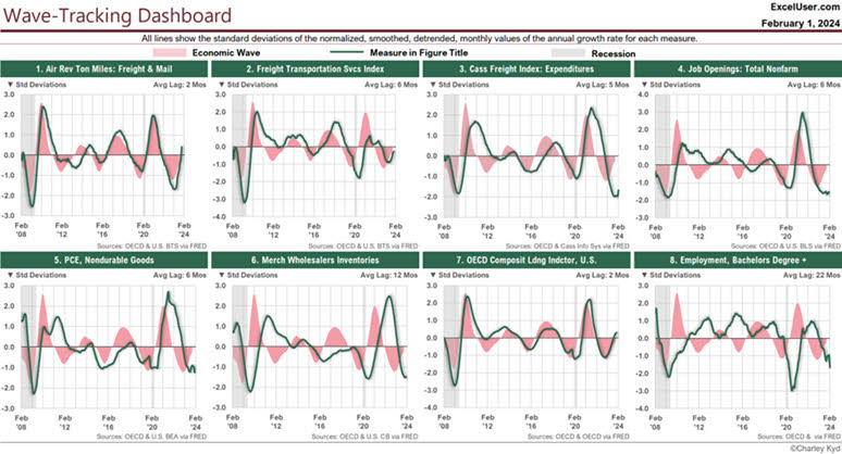
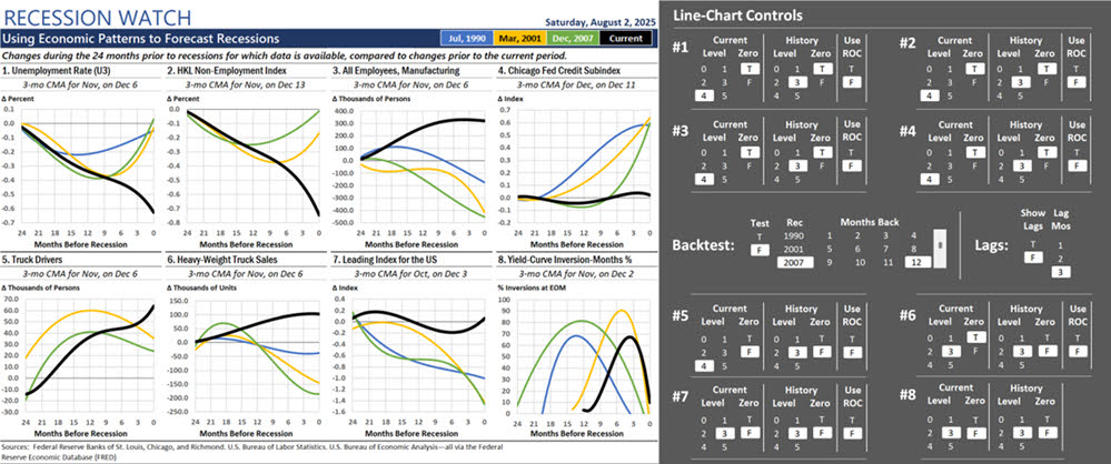
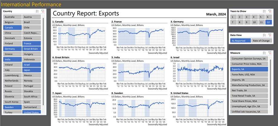
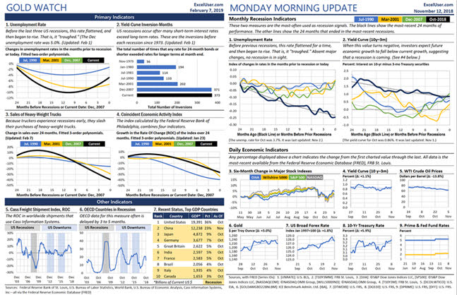
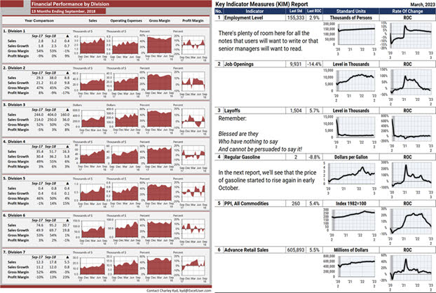
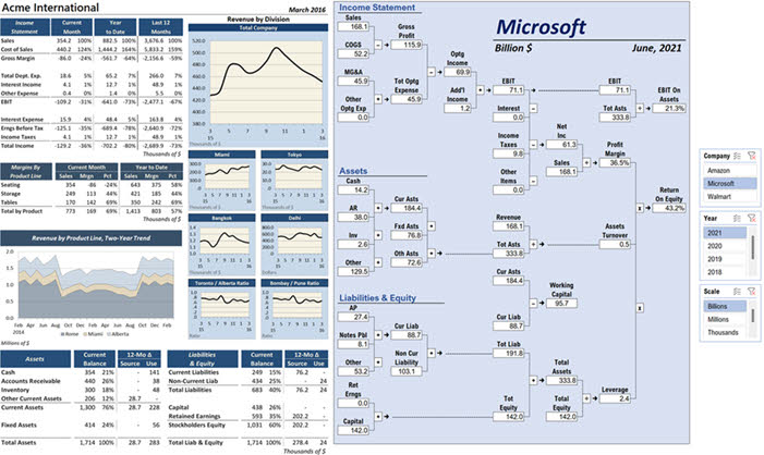
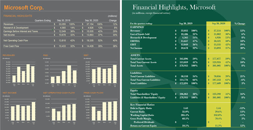
This P&L compares any two companies listed in the Company slicer in the top right. The data comes from Sharadar. But in your company, you easily could enhance the report to benchmark your own performance against that of any public competitor. Power Query would flow data both from the cloud and from your ERP’s General Ledger Trial Balance—mapped to the simple chart of accounts that Sharadar uses. This dashboard allows you to compare the 20-year trend for any summary account or KPI for any two public companies. Here, you can see that in 2018, Apple and Microsoft had nearly identical debt-to-equity ratios. But by 2023, Apple’s exceeded 5.0 while Microsoft’s dropped to 1.0. You can use ChatGPT or Copilot to learn the reasons for each company’s change in leverage policy. And if you compared your company’s trends to those of a public competitor, AI could help you to understand likely reasons for your competitor’s performance. The top-left slicer (Compound Annual Growth Rate) changes the table’s calculations. The slicer below it (Centered Moving Average Months) changes the smoothing setting for all charts. In each header, a data validation dropdown allows Plumbers to choose the data to display in the chart and its labels, from a list of about 170 types of food. You could set up a similar dashboard to display performance for divisions, departments, sales regions, products, etc. This dashboard started as a copy of the previous, food-price dashboard. Then I changed its colors and gave it FRED IDs about energy prices in the U.S. So after setting up the first report, setting up others like it is easy to do. From a manager’s perspective, the advantage of showing many charts in dashboards like this is that managers easily can view one chart in the context of all the others. So, for example, they could ask why one data series is trending down while related series are trending up. I designed this dashboard to report economic data that changes daily. So when I update it each evening, its title automatically displays the name of the next business day. The large chart shows the annual rate of change each day for three stock indexes. By plotting the rate of change, we easily can compare three different measures—like three different stock indexes—in the same chart. In your company, using a daily or weekly dashboard like this would allow you to track the smoothed trends in nearly any data your managers care about. This dashboard displays two data series in the context of the (gray) Great Recession and short Covid Recession. The pink area plot is the same in all charts. It displays a repeating, 36-month wave that I discovered in economic data. And each chart compares the wave to the growth rates of different economic data. As you can see, the eight measures track the wave closely, often after a lag. Widely diverse companies like Apple, Caterpillar, and probably your company show similar patterns in the growth rates of their revenues. About 10 years ago, I noticed that several economic indicators performed in a similar way in the months leading up to the three previous recessions. So I created this dashboard to help me spot the next recession by comparing recent data (the black line) to those earlier patterns. The block of slicers at the right provides five data-transformation settings for each chart and five other settings that apply to all eight charts. Keep this figure in mind when you’re looking for patterns and anomalies in your own data. This shows the performance of 15 economic measures for each of nearly 50 countries, nine at a time. One slicer sets the number of years to display and another lets us choose how the data is transformed before it’s plotted. In your own data, using a dashboard like this is a great place to start your analyses when you want to explore trends in a lot of data—like GL accounts— and you’re not sure what you’re looking for. And then, after you discover patterns and anomalies, you can set up alerts in your flowbooks to tell you when the patterns and anomalies return. In your company, if a senior manager wants a one-page report that shows a variety of data from multiple sources, you can display it easily, somewhat like these reports. Although your charts and tables can be updated with one command, the commentary takes more work. Soon, perhaps, we’ll be able to use Copilot or ChatGPT to write reliable explanations automatically. Until then, your ability to update the charts and numbers with one command gives you more time than you’ll probably need to research and write the comments each period. These two dashboards are mockups that show two variations of a similar layout that I discovered in 1980 in the Harvard Business Review article, “Graphic Indicators of Operations.” One nice thing about this strategy is that you could use one layout to report any number of pages of reports—pages that you could save to PDF or flipbooks. In the blue version, the key is to treat your comments like data that formulas return to your report from Excel Tables. That design gives you the power to view old reports, including old comments, with one click of your slicer. The report on the left shows artificial data to illustrate what a one-page financial summary might be like. And the report on the right is a type of Du Pont chart. The slicers to the right of the chart allow me to choose the company, year, and order of magnitude to use to display the data. More generally, think of the page on the right as an infographic. You can display numbers anywhere in a display, and then easily update your report each period. I once spent a Saturday skimming more than 100 online quarterly financials, looking for report designs I liked. These dynamic Excel reports use the two best designs I found. The one on the left was easy to set up. I had fun figuring out how to display the big dollar sign for the one on the right, but it’s too fragile to use in real life. More generally, as an Excel Data Plumber, remember to keep copies of good-looking charts and reports you see online. With Excel, you can copy those designs almost exactly—and then modify them any way you want.

Interactivity Is Optional—But Interactivity-Readiness Isn’t
Not every dashboard needs interactivity. Some are built for quick consumption—not for exploration.
But every real dashboard—as opposed to mockups—must be dynamic. That’s the foundation. And every dynamic dashboard must be designed to support interaction when the time comes—because that time usually comes.
Interactivity is how Plumbers test ideas, explore patterns, and build leverage into their work—across dozens of scenarios. When it’s needed, it should be easy to add. That’s why flowbooks are built to support it—even when it’s not used right away. And when managers want a new view, a new KPI, a new comparison—it’s already there, waiting in the slicers.
In dynamic dashboards—that is, flowbook dashboards—every slicer becomes a strategic lever. Every setting becomes a design choice. Every choice becomes a reusable system.
That’s how Excel dashboards stop being one-off deliverables—and start becoming infrastructure.
If You’re Still Delivering Static Dashboards, You’re Delivering Less Value Than You Think
Excel hasn’t failed you. The way you’re using it has.
If your dashboards aren’t dynamic, they impose a massive time tax. If they can’t become interactive easily, they can’t adapt. And if they can’t adapt, you’re stuck doing the same work—again and again—while AI replaces the next layer of white-collar labor.
The Excel Data Plumbing Strategy changes that.
It gives you the structure to automate your dashboards. The leverage to adapt them instantly. And the clarity to build systems that explain, not just report.
So stop wasting your time with static dashboards—like I did more than 30 years ago. Start building dynamic, reusable dashboards that get smarter every month.
That’s how Excel becomes ultra-productive. That’s how you become indispensable.
To begin, learn about the EDP Institute here.